#ARSENALSECRETS: ARCHITECTURE OF THE EXHIBITIONS
Recently we’ve talked about #ArsenalofLight, a project to implement a complex, professional lighting system for the Mystetskyi Arsenal exhibition space. Today, I would like to touch on another my favorite topic — the subject of space, and specifics of work with the architecture of the exhibition, working with form, volume, and light. The subjects that are quite abstract, on the one hand, while also very, very specific on the other. I’d like to share about how exactly we work with our colleagues — curators, and how we reach our final, collective decisions for an architecture of the exhibition project that should help the viewer delve into the story that the curators want to tell.
I will start with a personal memory. Some time ago, while playing with my little son, I put a bowl with dough on the stool. He was fascinated by this new experience: mixing, touching, dipping his hands into this viscous mass. I was surprised by the thing that happened next: after being done playing with the dough, he looked under the stool and tried to observe the dough from the bottom perspective — through the bowl and stool. He wanted to experience this magic from all sides. Indeed, until some point, children get to know the world tactfully and by volume, unconsciously searching for its all possible characteristics and trying to “describe” the world in relation to themselves. However, most of us in the age of 5-6 years start preparing for school, and then we go from the learning of space in volume to the plane. The world we used to experience through our hands, and look at from different angles, moves to the pages of workbooks and textbooks. At that moment, a person has to learn to imagine the space in quite a new way.
A little later, we have to learn to imagine certain physical or chemical processes through formulas, and three-dimensional geometry in 2D format. “An infinite line intersects an infinite plane” — for the majority these tasks are pointless. After finishing school, the person’s thinking process often consists of small, fragmented episodes: a right-angled triangle and circle are easy to comprehend, but the pyramid and sphere on an inclined surface are not. The person can take two-dimensional shots from different sides, but it is hard to combine it into an image.
Sometimes I think that the inability to think of space/object in volume is a real social problem. Such a way of thinking allows for distancing yourself from an object, for looking at it from different angles, and see how several objects interact in one space, and thus — see the change and consequences of such interaction over time. These are all the skills I need when working with exhibition space and developing architectural solutions.
There is another factor that is crucially influencing a person’s perception of space, and therefore how s/he makes the exhibition as an author or specialist, or sees the exhibition as a viewer. It is the architecture that surrounds us.
How does architecture influence and shape us? What do we see, and most importantly, how do we perceive it? I will not write about the blue-green, peeling entrances or kiosks, and how these surroundings have become the everyday norm for many of us. Instead, I will refer to the lectures on the “total installation” by Ilya Kabakov. In the introduction, Kabakov describes his view of the difference in the perception of space and an object in Western and Soviet society. For the former, the dominant role belongs to the object/item. Western society has many objects — they are functional, beautiful, new, they fill the life and “stick to the soul”. Space is quite “clean” and functions in a way to not disturb and also serve the functioning of the objects.
In our terrains [the latter — Soviet society], everything was different. “If they (objects) exist, then they all are old, shabby, and dirty. If these are mechanisms, they do not work properly and function as a crowbar… it all looks like one another… and all together reminds a mountain of junk of about the same color. ” But dominant is space in this case. A person in such an environment easily recognizes the rules of behavior outlined by the space: whether s/he is at the neighbor’s house or home, in the director’s office or the subway — “Every place has its distinctive face, its image, which all are quite aggressive”, according to Ilya Kabakov.
Let’s think now what, considering this experience of space and object, happens in exhibition projects? The Mystetskyi Arsenal team can act as both the author and the project curator, or as a support team when working with a guest curator, and as a team of experts. From this experience, we collected a whole set of different observations. I’ll share my own.
Often I observed how curators or exhibition designers considered each artwork or installation individually, not paying enough attention to the integrity of the exhibition as a single statement. Each artifact could’ve been so comprehensive and valuable to them that they often forgot that the viewer may get lost in this creative chaos easily and won’t grasp the essence of the exhibition and what story the authors want to tell.
My experience strongly suggests that the architecture of a project does matter. It helps us to express our thoughts more clearly and to move away from “water in the text” (contentless or useless words and phrases). It forces us to divide the flow of the beauty into sentences, chapters, and yet combine the episodes into one complete statement. Le Corbusier, for example, said that architecture is about putting in order the problems that are being discussed.
For Mystetskyi Arsenal, working with an architect has become a “pleasant necessity” because of space itself. Each of our projects covers approximately 4,000 square meters, which is a larger area than two exhibition floors at the National Art Museum of Ukraine. The Old Arsenal building, which provides space for major exhibition projects (besides Mala Gallery) of Mystetskyi Arsenal, is an old majestic fortress, not a cozy museum. Not many curators have experience working with so many square meters and with such specific space.
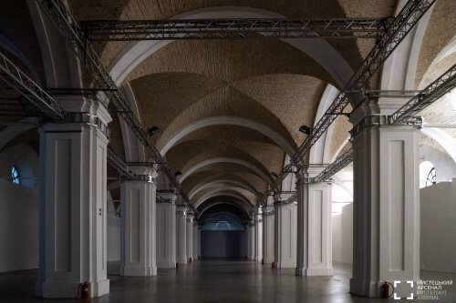
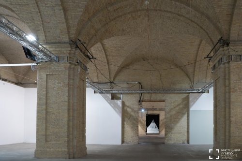
The Old Arsenal has a very powerful architectural form that dominates, being a pronounced and emotional object on its own, which also has different textures (brick or flat walls) and, of course, these magical vaults. All the halls are tall and vast. That is why when working on projects, we are always faced with a super-task: to structure and integrate the exhibition episodes into this expressive space in a way that would ensure the viewer won’t get lost or distracted by architecture.
 |
 |
The left wing of the Old Arsenal building. The right wing of the Old Arsenal building.
Photo: Oleksandr Popenko © Mystetskyi Arsenal
As a result, my colleagues and I have developed several approaches when working with architecture.
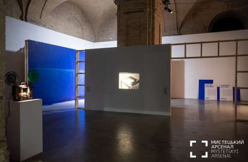
First, we make a “shell” of the exhibition (using color or display cabinets / showcases / partitions) and we use a single, walk-through method of presenting artifacts. This approach was used in such projects such Amazing Stories of Crimea, 2019 (architect Oleksandr Burlaka, Ukraine) or Revolutionize, 2018 (studioBASAR, Romania). This method provides an opportunity to develop the idea of a presentation, while not having access to all of the artifacts yet, but using only their description, dimensions, and sometimes only the type of object.
This happens when many curators and museums are involved in work on the exhibition, and who are responsible for different project’s segments and story-lines. In such cases, a curator or researcher may know “their” objects but not have physical access to them; or the creative team may be at the stage when it isn’t decided yet which particular object of the series or type will be chosen to display. The mentioned approach allows working with the integrity of the exposition. In this way, we combine all the elements of the project, emphasizing its unity. This method is great for monographic projects or to describe a single major phenomenon.

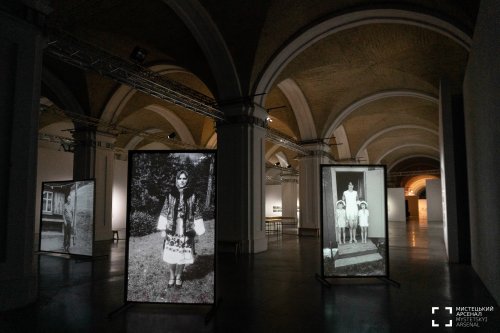
The other method, on the contrary, crystallizes the episodicity, especially when we want to break a project into stories purposefully and assign each their own characteristics (while uniting all by theme). This method is being built around a specific subject and requires a different algorithm of the working process. Good examples of this approach are the projects Paraska Plytka-Horytsvit. Overcoming Gravity, 2019 (architect Serhii Petliuk), Pure Art, 2017, and Japanese Art Exhibition, 2017 (the architect of both projects is Oleksandr Burlaka). For the latter, the idea of traveling the “islands” was used. Therefore, such principle was conceptually necessary.

Photo: Oleksandr Popenko © Mystetskyi Arsenal
Every time we start working on a new exhibition, we describe to the architect what this project is about and what story we want to tell. We never provide just a simple list of artifacts, because the work of an architect is an author’s statement at the same time that assists the curators. Mystetskyi Arsenal uses this approach in purpose; for us, the architecture of the exhibition is one of the “signposts” for the team to follow while creating the project.
After these fundamental decisions were made, the next is choosing the tools. This process is very practical, applied, and requires additional experts joining the project team: engineers, lighting, and tender procurement specialists. They all should have their heart in the project just like everyone else. We’ll discuss it next time.